I have finished working on my magazine and I really enjoyed the task
Friday, 2 March 2012
Evaluation
At first I was interviewed on some of the question of the evaluation so I've uploaded it to the blog.
In which ways does your media product use, develop or challenge forms and conventions of real media products?
How does your media product represent particular social groups?
What kind of media institution might distribute your media product and why?
In which ways does your media product use, develop or challenge forms and conventions of real media products?
How does your media product represent particular social groups?
What kind of media institution might distribute your media product and why?
I think that the following institutions are most likely to distribute my product: Mag+ and Music mags are online distributors. Digital publishing is now becoming more popular with 17% of magazines now available online; therefore this would enable my product to be distributed on a larger scale if this method was used. Another possible institution to distribute the Whiz is the Bauer Media Group. I think this company would want to publish my magazine as they are starting publishing more music magazines and I don’t think they have found a hip hop genre magazine yet therefore the whiz would be the best option as it is knew and covers up their search criteria’s: age group 15-19, hip hop genre, must cover up fashion and interesting interviews with coming up young stars.
Who would be the audience for your media product?
The target audience for my media product is teenagers and young adults both male and female aged from 15-19. I have chosen this age group as my target audience as they are more likely to buy music magazines and be interested in hip-hop music. I have targeted the magazine to both genders as I wanted to target a wider audience. Readers or their parents (depends on who's going to be buying the magazine) will fall into C1/C2 socioeconomic group as my magazine will cost £3.50. The reader of the magazine is going to expect to see a hip hop superstar on the front cover and a lot of show off. My reader will have a strong sense of fashion and always desire the latest music, clothes and gadgets. The reader must be interested in all kind of music awards and other achievements as well as hip hop stars' lifes which is going to be one of the main parts of my magazine. To choose my target audience, I did research to find out if there was a gap in the market of music magazines. I found that there weren’t many magazines aimed particularly at the social group of “hip hop” so I decided to focus my magazine on this genre. I am also interested in hip hop and rap so I felt this would be give me more ideas for my product and allow me to relate with my target audience.
How did you attract/address your audience?
I feel I have attracted my audience in a variety of ways. For example on my front page I have used an image which fills the majority of the page to grab my audiences’ attention. I have used the image of Josh as he is 15 years of age and is in the age group I have targeted my magazine at. In each of the images I have used I took into consideration what the people were wearing as I wanted the audience to relate to the magazine for example people with the same style in clothes. I have used conventions in order to attract my target audience. For example a conventional layout which I felt would attract my audience. The fonts I have used are also conventional and are bold to attract the audience’s attention. I feel the colour scheme I have used also addresses’ my target audience as I have used neutral colours and fonts instead of using a distinctive colour such as pink. I also collected audience feedback throughout my project to make sure they liked my design and colours I used.
This presentation is going to include another two questions: What have you learnt about technologies from the process of constructing this product? and
Looking back at your preliminary task, what do you feel you have learnt in the progression from it to the full product?
View more presentations from carolinebirksatwork.
Wednesday, 22 February 2012
Audience feedback
After finishing with my front cover, contents page and double page spread I' ve decided to ask some people from my school what do they think about my magazine. As an interviewer I've picked Abrar Quashem as his English is good enough and easy to understand. Abrar interviewed four people from three different years. All of them were aged as my target audience was.
Thursday, 9 February 2012
The magazine
On this post I am going to show you the final drafts of my magazine and how will my magazine look :


Tuesday, 7 February 2012
Double page spread
Hello, today I have finally finished craeting my double page spread and I am going to show you how it was created "step by step"
 Firstly, I've put the picture and the heading as it is the first thing which attracts a viewers attraction. During designing my page I decided that I will stick with stereotypical double page spread when there is a picture on the left handside and the text on the right one
 After completing my first step I started working on my second one. I've added page numbers and the ropic from the front page in order to concentrate viewer's attention even more.
 On the third step I' ve added the interview itself. However, I didn't have enough space to fit the whole interview, therefore, I am going to create a second double page spread for this article. Unfortunately, I am not going to post the process of creating the second page here :(

On the fourth, and hopefully the last, step I have put everything into staright lines and highlighted the questions,so the reader can easier get through the interview in order to find specific questions/answers he/she is looking for. Also, if you compare this draft to my design it was changed as I didn't have any space to put the lure "I tak 3 L's to the head : LOVE.LIFE.LIVE". There have been some more changes in the draft compared to how it was planned to be such as the allocation of the picture ( it was moved to the left) and there also is an extra page for current topic.
 As you can see I still had to make some changes as the interview had some spelling mistakes in it. Also I've added more arrows so it is easier to see that there is another DPS for this interview.


Saturday, 4 February 2012
the Interview
Today I've spent my time on inteviewing Josh.. The interview went quite well and it is long enough to even create two double page spreads. I have listed the interview underneath if anyone would be interested to read it:
TE: Hello Joshua and thank you for coming today!
Jo z : Hey.
TE: So how does it feel to be back in London, the place where you started from?
Jo z: Feels a bit funny, because it is where I was born and where I belong really. I clearly remember learning how to ride a bike and how I went to school for the first time, mostly everything.
TE: Wow, must bring good memories to you then.. Where exactly were you born in London?
Jo z: Hackney, East London. Probably the worst area to be born in London.
TE: Did it affect your life in any way?
Jo z: Yes it did, the first time I saw someone being shot was when I was 9. So I had loads of experience and kind of always knew how you can end up being if you mess with wrong people.
TE: Have you ever had anything to do with these “wrong people”?
Jo z: Well, when we are young we always want to try something knew so at some point I was with the wrong group of people but it all changed when rap came into my life. I knew I had to make the right decision otherwise my life was going to the same way as many teenage boys before me.
TE: So how old were you when you started to rap?
Jo z: When I was 10 but it was mainly just playing around with some words, I was 15 when I seriously started thinking about this as a career.
TE: What made you think you could become successful?
Jo z: I was popular on the streets and people liked my music. I could have been walking back from school and some older people would just give me a lift, that’s how popular and respected I was getting at some point. I took every opportunity to perform in front of groups. I loved the attention and I knew I was good.
TE: Was there anyone who didn’t like what you were doing?
Jo z: There are always haters in anything you do, so I remember my mates getting involved and being jealous about the attention I was getting but it didn’t really stop me.
TE: So how did you end up being popular worldwide not just in East London?
Jo z: Once, while I was selling my albums out of my car, some big guy came up to me and asked me if my name was Joshua so I said yes. I didn’t realise that this guy was going to change a lot for me, it was Jay-z. He was just walking around with his bodyguards and he saw me trying to survive on the streets by selling music so he took me as his apprentice and helped me out a lot. My life changed over night. We left London and I spent the next few years in America recording and hanging out.
TE: Now it doesn’t seem you are struggling, I can tell that by looking at your watch. Do you still keep on touch with Jay-z as he doesn’t need to help you to survive anymore?
Jo z: (laughs).. You make me laugh man, I don’t struggle now but I am trying to help people who do, just the way Jay-z did it for me! Obviously we do keep in touch, he is like a father to me and I love him a lot, also Jay-z is my music mentor so I can’t really get away from him.
TE: That’s great that music has helped you to find some real friends, how is your new album doing?
Jo z: It is great, almost finished and will be out in a couple of months; I worked hard on this one and put everything I had into it. As Jay-z taught me “every new album must be a bit better than the previous one”
TE: Never thought you can improve anything in your music, you are just a great rapper Jo z! How is your new charity website project doing?
Jo z: It is doing really well as most of my fans are really nice people and they wouldn’t mind giving some money to people who struggle or need it.
TE: So what type of charity are you supporting?
Jo z: I help poor people in Nigeria as it is my second home and I just can’t stand seeing people struggling there.
TE: Do you spend any of your money on donations then?
Jo z: hmm.. Not really, I prefer saving than giving if you know what I mean, but obviously I do a lot for this charity! As I am getting older, I start realising that saving or donating money is way better than wasting it in one night. I changed a lot since the last time you saw me.
Thursday, 2 February 2012
Contents page making
After finishing my front page, which has taken the most of the time as I planned I am starting working on my contents page. In my plan my music magazine supposed to have two contents pages but I am going to create just one in order to help you to understand what's going to be like. Here is my first draft of the contents page :
 As it is my first draft I am obviously going to create some changes. I have decided to work on contents itself such as adding more information on :

As I have planned I was working on adding more information into contents bit. However, it went over Bosco's shoulder so I am going to try to put it around now.
 Now I have made the changes I've planned to make and now I am going to clearfy who's the main star of this page ( Bosco) :
 To finish the page and make it look very good I've added the issue number and the logo.. Also I've put some arrows to make sure the reader understands that there is another contents page:


Thursday, 26 January 2012
Front page making
Today,finally,I've started working on my front cover and I will show you the progress of it step by step( every time I make some major changes) :

After creating the first draft we can see I am trying to stay close to what I've planned to do in my design. However, some changes may be made to the design in future steps.

As you can see I've removed the QR code and decided to move it to the content page as people don't usually use QR reader these days , so it would just take up some space. Also I have moved my barcode to the right as it makes my magazine look more original. Another change made at this step was putting quote "I take 3 L's to the head LOVE.LIVE.LIFE" together, at the bottom of the page, as it gives me more space for cover lines. Speaking about cover lines, I have added a few cover lines, however we can clearly see it is not enough so I am going to be working more on my magazine's front cover.

After creating my third draft, I compared it to the second draft I've made and could see a lot of progression, as I have added more cover lines it made my magazine look real. Also I had to change the strap line as Dappy was added to the coverlines so I had to swap him with another artist in the strap line.Hopefully this is the last draft, however, a few changes may be made

I've made some new changes to the draft I thought was the last one. The main change made was the picture as I decided to make it in black and white and it looked much better. Another big change made was added issue number and a qr code next to the barcode, which took up the free space and made my magazine look even more professional. I also edited the masthead, I made it bigger and added "New" on it so the reader can understand that this is a new magazine and also added the price which was £3.50 as I planned before. This is my final draft and hopefully there won't be any changes.
Friday, 20 January 2012
Final choice of layout design
By using comments of my followers, I have picked final choice of my designs for my front page,contents page and my double page spread. I have posted them bellow:


Wednesday, 18 January 2012
Layout Design
As it is very important how music magazine appeals I have been working very hard on design of its layout. In order to make my choice wider and more professional I've created 3 different choices of layouts for each page (front cover, contents and double page spread). Please comment bellow with designs you like the most and it will help me a lot with picking the final design.
Front Cover
1.
 2.
2.
 3.
3.
 Contents page
1.
 2.
2.
 3.
3.
 Double Page Spread
1.
 2.
2.
 3.
3.

Front Cover
1.


1.


1.


Tuesday, 17 January 2012
Font design of the masthead
Today I have been working on font of my music magazine and I was picking out of 12 different choices...The choices were:
 I' ve asked some of my classmates and my friends to circle fonts they liked the most and I collected the results afterwards.. An example of the sheet answered by my friend is :


After adding up all the result I've collected and thinking about it by myself I have a problem picking the final font out of two and they are :

The font on the left is more of a hip hop/rap genre font as it has some kind of "gangster"/ "graffity" styled font it self and some houses at the bottom of the font, which really would shout out it is a hip hop magazine. However, the font on the right handside is more likely to be a "show off" font which is very flashy and would stand out if I make it colorful.. As I can't pick which one of them is better I will be making my first drafts with both of the font and after I will see which one looks better with my music magazine...
Monday, 16 January 2012
The name of the magazine
Please comment on this post with the name/names you liked the most:
1) Lil Hop
2) Yohop
3)Lemmerap
4) MMW (my music world)
5) the Decibel
6) Bleep
7) Buzz
8) Rap Roll
9) Quack
10) Whiz
1) Lil Hop
2) Yohop
3)Lemmerap
4) MMW (my music world)
5) the Decibel
6) Bleep
7) Buzz
8) Rap Roll
9) Quack
10) Whiz
The Treatment
The magazine : Whiz
Target readership: Whiz is a new music magazine aimed at female and male teens who enjoy listening to hip hop music. Reader is aimed to be a teenager between 15-19, however, it could be anyone else as my magazine covers a lot about hip hop. Readers or their parents (depends on who's going to be buying the magazine) will fall into C1/C2 socioeconomic group as my magazine will cost £3.50. The reader of the magazine is going to expect to see a hip hop superstar on the front cover and a lot of show off. My reader will have a strong sense of fashion and always desire the latest music, clothes and gadgets. The reader must be interested in all kind of music awards and other achievements as well as hip hop stars' lifes which is going to be one of the main parts of my magazine.
Form and style: Whiz is a full color magazine which contains hip hop celebrities interviews, fashion, news and reviews of new albums. Front covers are going to include young hip hop stars which have a very perspective future and very famous in hip hop world. Cover lines will contain some very interesting news or quotes which the reader would be interested in. Graphics which will be used are going to be bold and catchy , also the front cover will be glossed in order to show that this magazine is a good value for money. As I said before the price will be £3.50, which is enough to make a good looking magazine and be afforded by teenagers.
Themes and typical features: Whiz will have a lot of regular features typical to a hip hop magazine. Every issue of my magazine will include an interview with a different star, reviews of new albums and some fashion updates. There will be a strong focus on superstars such as Lil Wayne, Jay z or Birdman; as these people have a good sense of fashion, brilliant songs and they are nice and wouldn't mind to be interviewed. Last pages of the magazine will include some reviews of coming up artists so the reader can develop his/her hip hop knowledge wider and wider as he/she reads Whiz. The writers will use language familiar to the target audience's so it will magazine as interesting as it is possible.
Potential adverties: Whiz will include some adverts in it but not as much a typical music magazine has as it is annoys the reader. However, there are some exceptions such as a specific music album or artist's clothe shop which covers up our topics (Fashion, Album reviews and etc) Clothe shops we might advertise in our magazine are: ozzys, yukka, sturbanclothing and sojones... We also will advertise iTunes albums so it is easier for the audience to download music they might need.
Editorial team: The editorial team will be made up of experienced and talanted writers who might have worked or been taught by people who worked in a famous/leading hip hop magazine. Mostly, writers must be very creative and have a good imagination and know how to attract the target audience.
The name of the magazine
In my opinion 7 replies were enough to pick a name. So my fanial decision is "Whiz", which is related to music and at the same time sounds good.
Thursday, 12 January 2012
Photoshoot
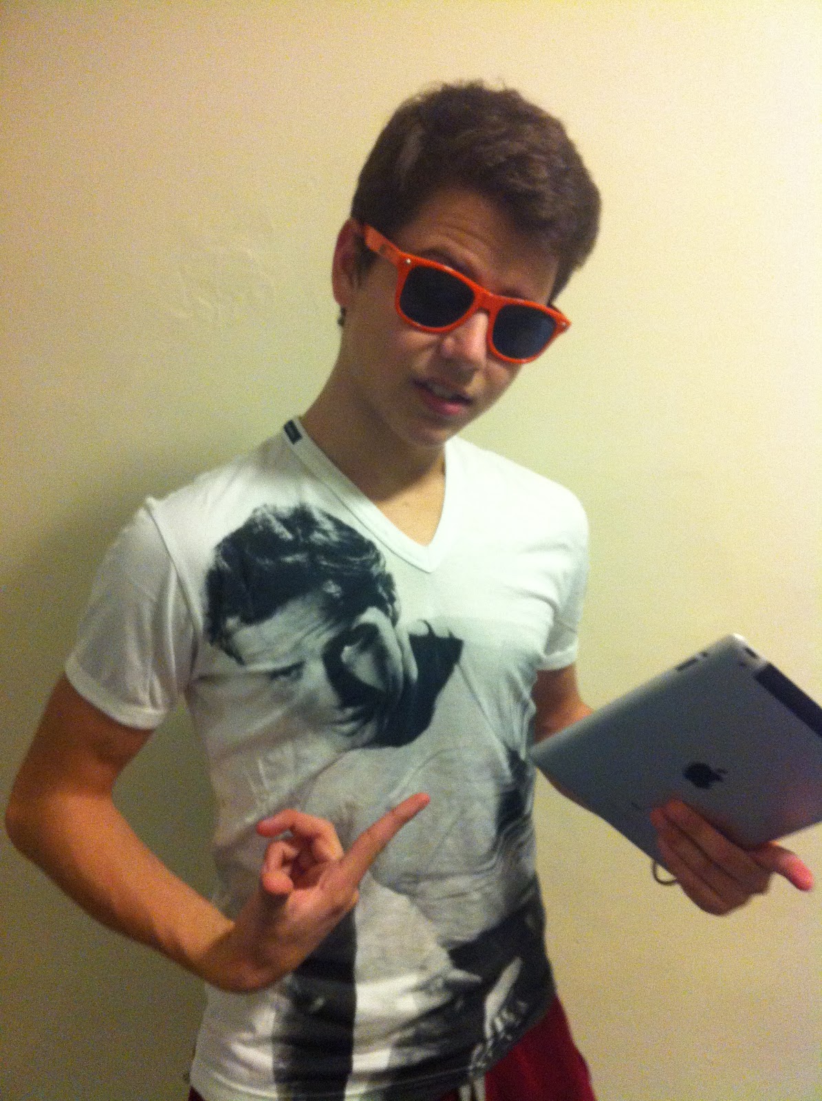
My young hip hop star is Josh Onjejocha which is known as “Jo z”. Jo z is an apprentice of world famous hip hop superstar Jay z. Jo z was born in Nigeria and in the age of 14 moved to the UK were I have met him and he kindly agreed on a photoshoot. I have picked Josh as my model as he looks like Jay z and he has charisma as well as he is looking good on pictures. I have taked around 120 pictures of Josh,however, I will post just some of them which in my opinion were the best .
Front Cover


Front Cover


Contents page
Another superstar I've picked was Bosco Rosillo Del Rio, who is known for his sense of fashion and his good look. Most of the people who are interested in hip hop know him and would like to dress like him. Bosco is a perfect choice for my fashion section. As he is my friend he let me take some pictures of him and I have posted just some of them bellow.


Double Page Spread
 As I said in on one of my previous posts I will be using the magazine with Jay z on double page spread as an example of my magazine.

Thursday, 5 January 2012
Planning Photoshoot
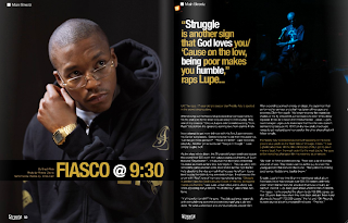
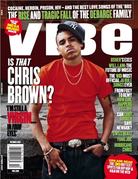
Today I have been working on my photoshoot and at first I started doing it by going through some of hip hop and rap famous magazines such as the source and vibe...:


 As we can see from pictures provided above most of the magazines' front cover pictures are taken in a mid close up shot in order to make it clear who is the main star of the issue and it is a good idea which is going to be used in my magazine. Also, mostly, the background is something dark or something doesn't get a lot of readers' attention to concentrate them on the main star. Speaking about the way the "stars" present themself's all about how much money they have and to show their status and people love it. Their tatoos, watches, necklaces and sunglasses, clothes and hats, eveyrything must be matching and very fashionable and I have noted that.
Things I need to do for my photoshoot for the front cover:
-mid close up picture
-dark background or something doesn't get a lot of attention
-I need to be using a lot of flush stuff in my photoshoot such as watches,hats, necklaces and tatoos.
After having an idea of my front cover I started thinking of orginising my double page spread too and here are some examples I've looked at..:


As we can see from pictures provided above they are all different types of shots and they all look very interesting and attractive. Mostly pictures take up the most of the space on the left page and the text is put on the right page and it does look very good. Also the idea with whole page picture helps the photographer to show the model and help the reader to understand what and who he or she is reading about and as I mentioned before it helps the stars to flash their accessories and cloth. Speaking about background it is either a black or white wall and nothing else which helps the star to stand out. However, the white background attracts me more.
Thing I am going to do for the photoshoot of the double page spread :
-mid shot
-a big picture
-a lot of different accessories and outstanding clothes
-white background
Subscribe to:
Comments (Atom)