Thursday, 26 January 2012

Front page making

Today,finally,I've started working on my front cover and I will show you the progress of it step by step( every time I make some major changes) :


After creating the first draft we can see I am trying to stay close to what I've planned to do in my design. However, some changes may be made to the design in future steps.
As you can see I've removed the QR code and decided to move it to the content page as people don't usually use QR reader these days , so it would just take up some space. Also I have moved my barcode to the right as it makes my magazine look more original. Another change made at this step was putting quote "I take 3 L's to the head LOVE.LIVE.LIFE" together, at the bottom of the page, as it gives me more space for cover lines. Speaking about cover lines, I have added a few cover lines, however we can clearly see it is not enough so I am going to be working more on my magazine's front cover.
After creating my third draft, I compared it to the second draft I've made and could see a lot of progression, as I have added more cover lines it made my magazine look real. Also I had to change the strap line as Dappy was added to the coverlines so I had to swap him with another artist in the strap line.Hopefully this is the last draft, however, a few changes may be made

I've made some new changes to the draft I thought was the last one. The main change made was the picture as I decided to make it in black and white and it looked much better. Another big change made was added issue number and a qr code next to the barcode, which took up the free space and made my magazine look even more professional. I also edited the masthead, I made it bigger and added "New" on it so the reader can understand that this is a new magazine and also added the price which was £3.50 as I planned before. This is my final draft and hopefully there won't be any changes.

Friday, 20 January 2012

Final choice of layout design

By using comments of my followers, I have picked final choice of my designs for my front page,contents page and my double page spread. I have posted them bellow:


Wednesday, 18 January 2012

Layout Design

As it is very important how music magazine appeals I have been working very hard on design of its layout. In order to make my choice wider and more professional I've created 3 different choices of layouts for each page (front cover, contents and double page spread). Please comment bellow with designs you like the most and it will help me a lot with picking the final design.
Front Cover
1.
 2.
 3.
Contents page
1.
 2.
 3.
Double Page Spread
1.
 2.
 3.

Tuesday, 17 January 2012

Font design of the masthead

Today I have been working on font of my music magazine and I was picking out of 12 different choices...The choices were:
I' ve asked some of my classmates and my friends to circle fonts they liked the most and I collected the results afterwards.. An example of the sheet answered by my friend is :
After adding up all the result I've collected and thinking about it by myself I have a problem picking the final font out of two and they are :

The font on the left is more of a hip hop/rap genre font as it has some kind of "gangster"/ "graffity" styled font it self and some houses at the bottom of the font, which really would shout out it is a hip hop magazine. However, the font on the right handside is more likely to be a "show off" font which is very flashy and would stand out if I make it colorful.. As I can't pick which one of them is better I will be making my first drafts with both of the font and after I will see which one looks better with my music magazine...

Monday, 16 January 2012

The name of the magazine

Please comment on this post with the name/names you liked the most:

1) Lil Hop
2) Yohop
3)Lemmerap
4) MMW (my music world)
5) the Decibel
6) Bleep
7) Buzz
8) Rap Roll
9) Quack
10) Whiz

The Treatment

The magazine : Whiz

Target readership: Whiz is a new music magazine aimed at female and male teens who enjoy listening to hip hop music. Reader is aimed to be a teenager between 15-19, however, it could be anyone else as my magazine covers a lot about hip hop. Readers or their parents (depends on who's going to be buying the magazine) will fall into C1/C2 socioeconomic group as my magazine will cost £3.50. The reader of the magazine is going to expect to see a hip hop superstar on the front cover and a lot of show off. My reader will have a strong sense of fashion and always desire the latest music, clothes and gadgets. The reader must be interested in all kind of music awards and other achievements as well as hip hop stars' lifes which is going to be one of the main parts of my magazine.

Form and style: Whiz is a full color magazine which contains hip hop celebrities interviews, fashion, news and reviews of new albums. Front covers are going to include young hip hop stars which have a very perspective future and very famous in hip hop world. Cover lines will contain some very interesting news or quotes which the reader would be interested in. Graphics which will be used are going to be bold and catchy , also the front cover will be glossed in order to show that this magazine is a good value for money. As I said before the price will be £3.50, which is enough to make a good looking magazine and be afforded by teenagers.

Themes and typical features: Whiz will have a lot of regular features typical to a hip hop magazine. Every issue of my magazine will include an interview with a different star, reviews of new albums and some fashion updates. There will be a strong focus on superstars such as Lil Wayne, Jay z or Birdman; as these people have a good sense of fashion, brilliant songs and they are nice and wouldn't mind to be interviewed. Last pages of the magazine will include some reviews of coming up artists so the reader can develop his/her hip hop knowledge wider and wider as he/she reads Whiz. The writers will use language familiar to the target audience's so it will magazine as interesting as it is possible.

Potential adverties: Whiz will include some adverts in it but not as much a typical music magazine has as it is annoys the reader. However, there are some exceptions such as a specific music album or artist's clothe shop which covers up our topics (Fashion, Album reviews and etc) Clothe shops we might advertise in our magazine are: ozzys, yukka, sturbanclothing and sojones... We also will advertise iTunes albums so it is easier for the audience to download music they might need.

Editorial team: The editorial team will be made up of experienced and talanted writers who might have worked or been taught by people who worked in a famous/leading hip hop magazine. Mostly, writers must be very creative and have a good imagination and know how to attract the target audience.

The name of the magazine

In my opinion 7 replies were enough to pick a name. So my fanial decision is "Whiz", which is related to music and at the same time sounds good.

Thursday, 12 January 2012

Photoshoot

My young hip hop star is Josh Onjejocha which is known as “Jo z”. Jo z is an apprentice of world famous hip hop superstar Jay z. Jo z was born in Nigeria and in the age of 14 moved to the UK were I have met him and he kindly agreed on a photoshoot. I have picked Josh as my model as he looks like Jay z and he has charisma as well as he is looking good on pictures. I have taked around 120 pictures of Josh,however, I will post just some of them which in my opinion were the best .
Front Cover


Contents page
 Another superstar I've picked was Bosco Rosillo Del Rio, who is known for his sense of fashion and his good look. Most of the people who are interested in hip hop know him and would like to dress like him. Bosco is a perfect choice for my fashion section. As he is my friend he let me take some pictures of him and I have posted just some of them bellow.

Double Page Spread
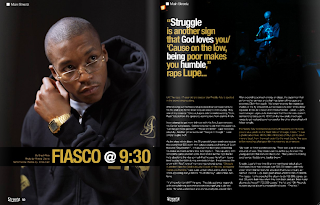
As I said in on one of my previous posts I will be using the magazine with Jay z on double page spread as an example of my magazine.

Thursday, 5 January 2012

Planning Photoshoot

Today I have been working on my photoshoot and at first I started doing it by going through some of hip hop and rap famous magazines such as the source and vibe...:
As we can see from pictures provided above most of the magazines' front cover pictures are taken in a mid close up shot in order to make it clear who is the main star of the issue and it is a good idea which is going to be used in my magazine. Also, mostly, the background is something dark or something doesn't get a lot of readers' attention to concentrate them on the main star. Speaking about the way the "stars" present themself's all about how much money they have and to show their status and people love it. Their tatoos, watches, necklaces and sunglasses, clothes and hats, eveyrything must be matching and very fashionable and I have noted that.
Things I need to do for my photoshoot for the front cover:
-mid close up picture
-dark background or something doesn't get a lot of attention
-I need to be using a lot of flush stuff in my photoshoot such as watches,hats, necklaces and tatoos.

After having an idea of my front cover I started thinking of orginising my double page spread too and here are some examples I've looked at..:


As we can see from pictures provided above they are all different types of shots and they all look very interesting and attractive. Mostly pictures take up the most of the space on the left page and the text is put on the right page and it does look very good. Also the idea with whole page picture helps the photographer to show the model and help the reader to understand what and who he or she is reading about and as I mentioned before it helps the stars to flash their accessories and cloth. Speaking about background it is either a black or white wall and nothing else which helps the star to stand out. However, the white background attracts me more.
Thing I am going to do for the photoshoot of the double page spread :
-mid shot
-a big picture
-a lot of different accessories and outstanding clothes
-white background

Wednesday, 4 January 2012

Photography

Before starting planning my photoshoot I have decided to do some research on this subject in order to understand and know more. At first I was looking through some very popular blogs of extremely famous photographers and I really liked some of their photos such as.. :
Herb Ritts
Djimon with Octopus, Hollywood, 1989
Christy in Valentino, Miami, 1995
Julia Roberts, Malibu, 1990
Henri Cartier-Bresson
An example of street photography, which was the genre of choice for Cartier-Bresson

Annie Liebovitz
Annie always looked for some dramatic portraits

Ansel Adams

This is one of the most famous Ansel's photos taken in Yosemite
Also I really liked a tutorial video of how to take great portrait photos on youtube and this is the link to the video: http://www.youtube.com/watch?v=wyxQKNpk58U
This research will help me a lot to take some good pictures for my music magazine

Tuesday, 3 January 2012

Internet research

I have been researching for a couple of hours and found a lot of useful information about music magazines. Mostly I was searching for circualtion figures and I found some. They are listed below. This information was taken from http://www.wordpress.com/ , http://www.guardian.co.uk/

UK Music Magazine Circulation Figures

BBC Music 42,810 (45,144)*
Classic FM 32,534 (35,751)*
Classic Rock 71,242 (70,301 / 70,188)
Computer Music 17,427 (18,261)*
Future Music 10,862 (10,860)*
Gramophone 32,313 (34,628)*
Hot Press 18,394 (19,387)*
Kerrang! 41,125 (43,253 / 52,272)
Metal Hammer 41,777 (46,004 / 50,269)
Mixmag 26,116 (30,159)*
Mojo 98,484 (97,722 / 100,507)
NME 38,486 (40,948 / 48,459)
Q 94,811 (100,172 / 103,107)
Terrorizer 11,641 (13,786)*
Top of the Pops 107,576 (119,739)*
Uncut 75,518 (76,526 / 87,069)
Word 26,555 (34,280)*
Empire 194,236 (194,016)
Sight and Sound 19,842 (19,733)*
Total Film 81,029 (85,031)

NME's circulation slips 16.4%


NME was the biggest circulation faller among music and film magazines in the second half of 2010 with a 16.4% year-on-year decline.

Mojo was on the up compared with the first half of last year, retaining its status as the biggest paid-for music magazine, according to the latest Audit Bureau of Circulations figures out today.

IPC Media's NME, which was the only title in the sector to report a double-digit year-on-year fall, had a circulation of 32,166 in the second half of last year, a 5% fall on the previous six months.

Bauer Media's music title Mojo had an average monthly circulation of 98,484 and was the only title in the sector to show a period-on-period rise with circulation up 3.2% to 94,617. Mojo slipped 3.9% year on year.

Another Bauer music monthly, Q, held second spot with circulation of 88,240, down 6.9% year on year and 1.4% over the previous six months.

Bauer's movie magazine Empire recorded an 11.1% year-on-year drop to 172,639, but remains the biggest-circulation title in the film and music sector. This was a 3.6% fall over the previous period.

But Future Publishing's Total Film provided some cheer with a 3.4% rise in circulation compared with the first half of 2010 to 78,709. The magazine slipped back 2.9% year on year.

IPC Media's Uncut held on to third place among the paid-for rock music titles with sales down 2% period on period to 72,586, a 3.9% fall year on year.

Future Publishing's Classic Rock is within 5,000 copies of third place with 67,695, down 3.7% period on period and 5% year on year. Stablemate Metal Hammer had a small year-on-year circulation rise of 0.1% to 41,826, a 5% fall compared with the first six months of 2010.

Bauer's Kerrang! leapfrogged Metal Hammer to take fifth spot with a respectable 4.5% uplift in year-on-year circulation to 42,967. The title fell 2.4% period on period.

Channelfly Enterprises' free music monthly The Fly remained the music sector leader with an average distribution of 107,771, down 4% year on year and 3.4% period on period.

Future Plus's free film title, Odeon Magazine, was top of the film sector with an average distribution of 186,220, down 9.3% year on year and up 6.5% period on period.

Visit InfoServe for Blogger backgrounds.