Saturday 17 December 2011

Audience Research Results

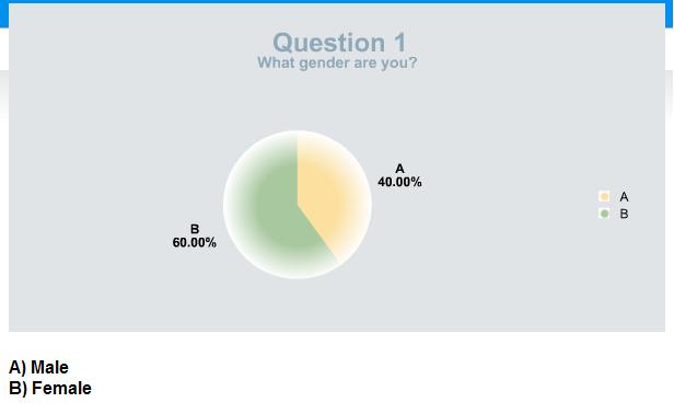
After uploading my survey on http://www.freeonlinesurvey.com/ I asked my classmates and my teacher to complete it.. I have made some graphs with results of the survey :


The "other" type of music included:
- House/ Electro
Question 8
What bands or artists would you want to see in a music magazine?
The answers were:

- Lil Wayne
Wiz Khalifa
- the most popular artists e.g rihanna, beyonce
- Latest and Popular bands. Bands that I that know and some new bands
- A band that I have not heard of.
- new teenage band which has g8 song like simple plan etc.
- Katy Perry
Snow Patrol
The Ting Tings
- Eminem
N-Dubz
50 Cent
- Kasabian, Placebo
- Skepta
- Swedish House Mafia
Eric Morillo
Avicii

etc.

Question 10
What appeals to you when buying a music magazine? (e.g. Front Cover, Masthead or Double Page Spread)

The answers for this question were:
- Front Cover
- front cover
- Front Cover
- What is said in the magazine; the doubla page spread.
- the image in the front cover and the cover lines
- Front cover - if the magazine features people I like, I'll buy it
- Front Cover
- Front cover
- Masthead
- The front cover- has to be colourful and eye-catching

After going through the survey's results I found out a lot about what people prefer and like in music. The results I have will help me to understand in which direction to create my magazine and what people would want to see in it. Mainly people who were asked to complete the survey were 15 - 19 years old. As far as I know teenagers prefer everything about superstars' lifes, their albums and interviews, how they dress (fashion) and what they do when they stuggle. However, I wanted to specify my magazine therefore I picked a genre for it by asking others. The genre I picked was hip hop & rap, which is mostly liked by all teenagers. As the purpose of the magazine is to gain some money I asked people how much would they be willing to spend and the price people picked the most was something between £3 - £4. Also by asking people to complete my servey I found out that everyone prefers to be getting some freebies and mostly it is free tickets, cd and posters. I had a think over that and decided that as people mostly buy music magazines every month or sometimes I will be putting some free tickets or cd's with posters every month into my magazine in order to attract people to buy it. However, I found out that people don't like participating in any kind of activities such as questionaires, so I am not going to add them or I will but very rarely. Also by going through the results I found out that people,mostly, get attracted by the fron cover and that's what leads them to buy a music magazine. Therefore, I will be working very hard on my front cover by adding a lot of colours to it with a very nice masthead.

Wednesday 14 December 2011

Textual analysis of a music magazine

Front page analysis
"The New Musical Express (better known as the NME) is a popular music publication in the United Kingdom, published weekly since March 1952. It started as a music newspaper, and gradually moved toward a magazine format during the 1980s, changing from newsprint in 1998." - the information is taken from wikipedia.org
NME magazine is one of many music magazines, competing with other music magazines on sale, such as Kerrang and Q magazine.  ‘The XX’ are the cover stars of this issue; this is because they feature in an article in the magazine. The magazine stands out with its eye catching hot pink and white text against the darker areas of the front cover, in attempt to grab the audience’s attention along with the direct address of the band image. All members of the band are dressed in black, making it contrast against the lighter background colour; this may suit the genre of their music with their relaxed but serious facial expressions. Romy Croft is positioned between the other band members and is the centre focus point, showing she is the lead member of the group. Most of the image is covered by text “so what’s next for Britain’s new favourite band?” however the word ‘favourite’ is only an opinion but wants to reach out to the fans and to people who haven’t heard of them yet. There is also a quote from one of the band members “There’s no plan to do a second album...” this is to give people an insight into the article and to draw in the audience to discover more about the personal image of the band and to find out what they might have planned to do next.
The target audience is probably of the mid teens for both sexes, as the magazine is youthful with the types of genres they would be interested in and the wording is short and snappy. The masthead and the cover lines are presented in capitals and the text with ‘THE XX’ (centred) is the biggest typeface (besides from the masthead) is also in clashing pink and white, so the audience’s eyes are drawn to this.
‘Revealed: the best bands, the biggest let downs’, this makes the audience feel part of a secret, and there is something they can discover. The next subheading ‘New Manchester RIOT’ the word ‘riot’ is bigger than the rest, this grabs the audience’s attention and they will see this on the shelves when they buy it. Also on the bottom, left hand corner the text ‘+ more...’ attempts to hook the audience’s curiosity, its aim to get them to want to take a look inside at the rest of the contents of the magazine.  ‘Festival Poll 2010’ is something the audience can get involved in.
The cover doesn’t look crowded but the publisher has made good use of space and the text and layout is clearly presented. More bands such as Arctic Monkeys are listed down the right hand side, so the audience can see what else they will find inside the magazine, the ‘+’ as a symbol, not the word, plus. 

Content Page analysis


This contents page of NME magazine is clearly titled ‘INSIDE THIS WEEK’ in bold black serif font, in the top centre. The audience do not need to be told it is a contents page; they can easily tell by the page numbers and can see what they will find in the issue. The contents page is laid out in three columns; the reader can easily find what they are looking for quickly if they are looking for something in particular.  Some of the page numbers are presented larger than the rest along with a picture that is related, so the reader does not have to look through a list of pages numbers to find what they are searching for and gives the impression they are more important. There are also a few quotes and a description so the viewer can get an insight of what they will find on this page. There is plus columns, which has the rest of the page numbers, this is easy to spot and the page numbers are in bold.  In the right hand corner of the page there is a red box, the white text against the red looks eye catching, it is simple and does not over crowd the rest of the page.
Double Page Spread analysis

At the top of the double page spread, there is a quick description about the article to entice the reader, it is separated to act as a title but is only to give a glance for the audience.  There is also a subtitle underneath this which gains the reader’s interest before they read the whole interview. All text is in black some parts like quotes are in bold to highlight specific interests; the way the quotes cut into the article is effective as they are the most interesting quotes from the interview and they will want to read on. The use of the large ‘I’ and ‘F’ draws in the reader’s attention to the paragraphs. These paragraphs are organised into columns so, in my opinion, is easier to follow and looks neat. The first picture on the left page is related to the subtitle, the top picture on the right page gives the impression of the band more laid back and shows the bands normal behaviour, and what the band is like day-to-day. The quotes are close to the pictures which link them to the article and make them seem friendlier. The language used in the article is informal in order to find a better connection with the audience.

Tuesday 13 December 2011

Textual analysis of a music magazine

Front Cover Analysis
The masthead is in lower case and capitals. It is also in sans serif which shows that it is current as well as the text colour. It is a light ‘young’ blue which makes it appealing to its audience. The masthead is fairly small in size compared to the other texts on the page and it attracts its target audience because it’s simple, yet cool and the way the text ‘presents’ is rotated at an angle gives it that edgy look. The main photograph is a medium close up of the artist Bow Wow in front of a grey backdrop which is lighted softly. The facial expression on the artists face is natural with a slight smirk on his face. Bow Wow’s photograph is positioned to the left of the page as opposed to the other images which are aligned to the right; this shows that there is a main story inside the magazine of the chosen artist (Bow Wow). Because the target audience of this magazine are black teenagers, readers can easily identify themselves with the photograph.
The texts on the front cover are in sans serif and predominantly in capitals. They are all of a medium weight and size. The colours that have been used are: black, blue, yellow, white and pink which represent energy and fun, this creates a youthful effect. Some of the texts are rotated at an angle which gives the front cover an edgy and cooler look and feel. There is a sketched image on the top right hand corner of the magazine. Another interesting element of the photographs is the way they are presented. Some photos have no background (e.g. Chris Brown & Rihanna), and the others that are used have a background (e.g. Jazmine Sullivan and Kelly Clarkson). The cover design establishes a house style with the word ‘black’ incorporated into the word ‘beat’. This is unique to the magazine company. This magazine cover will influence me in many ways, especially in the way the texts are positioned. I like the way this magazine has slightly rotated the texts.
Contents Page Analysis
The purpose of a contents page is to inform the reader of what is inside the magazine. The reader is able to navigate to the different sections of the magazine because the sections are in different colours for example, ‘Fashion and Beauty’ is in pink and ‘Music’ is in purple so it is easy for the reader to select specific parts of the magazine that they want to read. Also, the page numbers are very clear and the most important page number of each section is larger than the rest.
In the contents page, there are photographs of various images that relate to each category or the page. It also adheres to the overall house style of the music magazine with use of carefully selected images and audience friendly language. The page reveals that the reader is interested in fashion, music and celebrity entertainment.

 Double Page Spread Analysis
The main image is of the rapper Bow Wow. He is wearing casual clothing; this would be worn by the target audience. The interesting thing about the photograph is that it looks as if it has been torn. This is very smart as it reflects against the title BEWARE OF THE DOG’ seeming as if something dangerous has happened. The whole article is in sans serif font style, using a bright colour scheme (orange, green and blue). There are no columns in this feature page, neither is there an article, just two simple paragraphs.

Monday 12 December 2011

Music magazine textual analysis

Magazine - "DJ"
Publisher - "Thrust Publishing"
Published Since - 1991
Front Page


The masthead of this front cover can be clearly seen because of the size and the colour of itself. The colour was used for the masthead is red, which stands out on white background. The masthead says "DJ" which allows the buyer to understand that this magazine is going to be about "dance" music and incase the buyer doesn't understand what DJ stand for, underneath the masthead it is written "living &breathing dance music" which after reading this will clearly give the buyer a klnowledge of type of this magazine.
The front cover attracts audience by using a lot of different bright colours in the masthead, coverlines and the headline and a mid-close up picture. The headline "SBTRKT the masked man speaks" is posted in yellow colour and almost as big asthe masthead and somehow attached to the picture with the colour. However the headline is still not clear for the reader as it says "SBTRKT" this could be some abbreviation which some people wouldn't understand. The picture is a mid-close up picture which has man's face covered up with a mask.
On top of the masthead there is a strapline which says "free santos multimedia CD! music and data galore!" in a non stereo typical way by using a white font colour on a white background, when ususally it is used for attracting people and would have been written in some outstanding colour. However, it could of been done like this because of the notice straight next to it that says "best of british launch issue" , which is posted on a yellow graphic and probably is there to attract more audience.
The coverlines printed on the front page of this magazine are in different colour which really attracts buyers eyes and the contents themselves are really attractive and interesting. The coverlines are positioned in some kind of an order. when as a reader, I would expect them to be spreaded around page reading this type of a magazine.
Talking about the price of tha magazine it is very reasonable and it is £3.95 as the magazine is released monthly and aimed at any age group with a specific audience "dance" music fans or people who prefer "dance" music.  All this information is situated at the bottom of the page where it is expected to be normally. There is also an iTunes logo, which possibly allows user to understand that songs of this magazine could be downloaded there.
Contents page
Now I will be talking about contents page of this magazine. As soon as we open the page we can see a similar photo to the one on the front cover, which is really interesting and unusual. I wouldn't really say this content page is different to a stereotypical one because it has section headings which are put in an order and highlighted with different colors. In my opinion, highlighting section headings is a very good idea as it is easier for a reader to find what he/she really needs to find and it makes the page brighter. The information provided in the section headings is put in different colors too which makes this page brighter and less boring to look at. All the contents are followed up with a page number, some of them even have a picture to illustrate what is the section about to help the reader to get into the magazine. There are three columns: the first one is a mix of texts and a picture,the second one contains just text and the third one has only pictures. The "features" section is kind of highlighted on this page as it is printed in bigger fonts to the other sections and is the only section on the left side of the contents page when all the other sections are printed in another column. This could have been made in order to highlight the purpose of the magazine which is feautures of djing. As I said before, there is a picture on this page which gets into your attention is printed underneath the main section and is referred to one of the titles of this section and could possible be the reason why people bought the magazine. The pictures on the contents page have a bigger font for the page numbers and it is clearly  for the people who don't like reading and just want to see at a glance.
Double page spread
The double page spread I picked was about the front cover page's picture and the highlighted title of the contents page. The picture is very big and interesting because of the mixture of its colors. Also it is very mysterious as it is some kind of a mask in a mid close up shot. You can clearly see the masthead as it is printed in an enormous font in yellow which really stands out in black. There is also a massive drop cap underneath the massive masthead which makes the page really outstanding.The background color of this page is black and it is unusual to a stereotypical magazine. However, the font colors picked are bright and easy to read. On the first page there is a mixture of a picture and text on which the picture is clearly the most important part, but the second page has just only text. However,it has small titles on it which are standng out of the text and make it less boring. Also the text is written in informal language, using a lot of slang words and has some of taboo language which makes the text very interesting and really proves that it is the main article. 

Adobe InDesign

Today I was working on my Adobe InDesign and I found it very easy. In my opinion Adobe InDesign is very similar to Adobe Photoshop and it is very comfortable and easy to use. However, there were some things it caused a little bit of trouble, but the lesson is finished and I've completed my task.

Friday 9 December 2011

Audience research (Survey)

I need some help with creating the magazine.. I need your opinions to know what people would want to see in a music magazine.Please follow the link and complete the survey!
http://freeonlinesurveys.com/rendersurvey.asp?sid=o20p4ug6kdr1xhs1019160

Thursday 8 December 2011

Comparing magazines

As I've planned, I was comparing four magazines. Stuff I was comparing from the magazines were: thier prices, numbers of pages , samples of advertising, typical articles and some more.. Here is my sheet with resutls.


Monday 5 December 2011

Action Plan

As I posted before the most important point in performing a task is having a plan, therefore the plan was the first task I have completed for the main task.
WeeksTasks
5/12/11Write action plan, Compare magazines
12/12/11Textual analysis, Audience research
2/1/12Internet research, plan photoshoot
9/1/12Take photos
16/1/12Layout design, font design, masthead design
23/1/12Make pages/Drafting
30/1/12Make pages/Drafting
6/2/12Make pages/Drafting
20/2/12Audience feedback, tweaking, evaluation
27/2/12Evaluation
Deadline2/3/12

THE MAIN TASK

As I've finished my preliminary task, I can start with the main task. I will have to be creating a music magazine, which has to include a front page, a content page and double page spread. I am starting it today, so watch out for some updates!

Friday 2 December 2011

Evaluating my magazine

I have just been interviewed about my magazine by my colleague Xenia and this is the interview
http://www.youtube.com/watch?v=kVvQzTphx5g

Monday 28 November 2011

Contents Page

Just finished creating my content page... please comment your thoughts underneath the picture in order to help me with the design, thanks.

Designing the content page

As i've finished with my front page, I am starting to work with the content page of my magazine.. Here are two possible different designs I might use for it.

Front Page

As the task is to create a school magazine, the front page is obviously the most important page, therefore I spent a lot of time designing it. Here is my dedesign :


I have just finished implementation of my front page, please comment underneath what you think about it :)

the final choice of MASTHEAD

I have created a survey and here are the results
The final choise was this font :

Friday 25 November 2011

MASTHEAD

Today I have been working on masthead fonts and I will list my final choses underneath. In order to pick one I will print out these fonts and ask one student from each year to pick best 3, then I will be able to pick one which was liked the most.

Thursday 24 November 2011

Photoshoot

I have just taken some photos which could possibly be used for my magazine front cover.Please comment if you really like one of the pictures. Thanks to Doncho "chop" Penev who was very kind and was modeling for the magazine.

I am finally back !

After a long rest I had because of my knee injury I am back and today I have been pratcising my photoshop skills. Of course I picked a football magazine as my example and I have worked hard on working with it. The main aim of today's lesson for me was to learn how to crop perfectly and how to match colours and pictures together.I think this lesson went well and I achieved my targets.

Sunday 20 November 2011

Questionnaire answers

Before I actually start designing I would like to post answers to my survey about the magazine.


Question 1
What would you like to see in the school magazine?
A) School gossips (e.g. relationships)
B) School events (e.g. sport,music)
C) Something about college (interesting facts)
D) Outside the school events
E) Fashion
F) IT ( information technology)
G) Funny section
H) History
I) Something to help you with exams
J) Other : "Complete list of all responses given to this question"

Question 2
Would you ever pay for the school magazine? if you picked "YES", please go to question 3, if you picked "NO" go to question 4
A) YES
B) NO

Question 3
How much would you pay for the school magazine?
A) 25p
B) 50p
C) £1
D) £2
E) £5
F) Other

Question 4
Which year group are you in?
A) Year 7
B) Year 8
C) Year 9
D) Year 10
E) Year 11
F) Year 12
G) Year 13
H) I am a teacher
I) I am a parent/relative
J) I am someone outside the school

Question 5
How often would you like to see the magazine released?
A) once a week
B) twice a month
C) once a month
D) once a halfterm
E) once a term
F) once a year

Question 6
What would you like to see on the front cover?
A) Students studying
B) Students doing sports activities
C) Students doing art activities
D) Students doing music activities
E) Students relaxing
F) Teachers
G) School facilities

Question 7
What colour scheme do you prefer to be used in the school magazine?
A) White and Black
B) White, Turquoise and Black
C) White, Purple and Black
D) White, Purple and Black
E) White, Purple and Black
F) White, Purple and Black
G) Red, Green, Yellow and Blue
H) Other "Black and Yellow"
"Black and Yellow"
"All colours"
"Orange, White and Purple"

Question 8
What would you prefer to see in the magazine more?
A) Images
B) Text
C) Both

Question 9
What type/types of images would you like to see?
A) Close-ups
B) Mid-shots
C) Long-shots
D) Extreme close-ups

Question 10
Did you find this survey easy and comfortable to use?
A) YES
B) NO

Starting to design

I am finally finished with the name so now I can begin to design my page. The first and in my opinion the main part of designing is Masthead. I will post some ideas of Edmundans' Masthead please comment whichever you like.

The name of the magazine has been chosen

The final decision for the name was made and it is Edmundians

Monday 14 November 2011

Finishing analysis!

I finished analysing some of school magazines and now I would like to summarize what I have done so far. I prefered reading "Student ID" to "Common Sense" and it was mostly because of the colours picked of the magazines. "Common Sense" looked more boring to me and more depressing. I made a list whith what I should include into my magazine and what I shouldn't :

Should be included

Colourful cover

A nice Masthead

A letter from editors

Pictures on the front cover

Should not be included

Boring colours

Random texts on the front page

Double repeat of content page

Analysing some other magazines:Content analysis of Student ID

Even thought the content pages of the magazines I analysed looked very similar, the actuall content is very different. "Student ID" is a magazine which is more about college life and includes topics, such as :
- year enrichments
- college updates
- university questions
- school music
- charity shop

And as we know it is a school magazine, so the target audience is TEENAGERS, therefore this magazine also includes topics which will be interesting for them :
- festivals
- fashion
- films

Analysing some other magazines:Textual analysis of Student ID

The content page of the magazine looks very similar to "Common Sense" and basically reminds me of it. What we can see on this page is a big header saying "Inside ID" , which basically gets us to understand that it is the content page.Also as I said before I really like the idea with a picture of the editors and a letter from them. Which helps us to know who the editors are and to understand their ideas more. Also by having letter, the editors could tell us what's going to be included into the next magazine.
However, even thought the content is made in a very good order, the pictures by the normal content doesn't look like a good idea to me, because the content is reapeted twice, but it still looks better than "Common Sense".
Because of the colourful cover I expected to see the content page made in the same way but expectations were ruined by seeing boring colours again.

Analysing some other magazines:Textual analysis of Student ID

By having a look at this magazine you can see a very bright and colourful cover, which gives this magazine a stand out from any other magazine. Also there is a very nice masthead in order to keep the brand. On the top of the masthead it says "Ludlow college student magazine", which,basically, shows what is the target audience for this magazine is like. A lot of pictures on the front cover also help us to understand what this magazine is like and what does it contain.
However, even though the colours really make the magazine outstanding they also make it difficult to read what is written by the pictures. I managed to read the text and it makes absolutelly no sense to me and it doesn't help me to get the content of this magazine.Also it feels like there is a little mistake with picking colours of the texts by the pictures, because it was very difficult to read some of it.
There is an advantage and a disadvantage of having bright colours on your frontpage but in my opinion it is a very good idea, therefore I will try and use it in my magazine.

Finally!

Just finished doing first analysis, a little bit behind but I will catch up

Analysing some other magazines:Content analysis of Common Sense

As I wrote before, the magazine is aimed at students of that college, therefore the magazine is mostly about :
- celeb stories
- student news
- student sex appeal
- film news
- some true life stories
Basically, it is about something,which will attract a teenager. I could use some of the ideas from Common Sense in order to make my magazine more interesting.

Friday 11 November 2011

Analysing some other magazines: Textual analysis of Common Sense


By opening the content page of this magazine the first thing we can see is the word "CONTENT" which is written with a fontsize,which is like twice bigger than the other fontsizes. The colour was picked for this main heading is very boring because it is black and the background is white.At the top of the page there is a masterhead which identifies the magazine.The masterhead is printed in the same colours as on the front pages and it is really standing out compare to other writings on this page. Straight under the main heading there is a list of articles which are in the magazine and it is written again in black. However, the content is very good in terms of the actual writing, on the right of the content there is another content which basically says the same thing but in pictures, even the heading says "what's in.." and it is straight under the main heading. The only idea I really liked on this page was the letter from editors, which helps readers to know what was included in previous page and what is this magazine actually about.To help us to understand more about this letter,the editors highlighted the key points of this letter with blue. There are also pictures of editors included, so people can actually see who they are. At the bottom of the letter there is a picture of the front page to show us what issue we are looking at and to identify the brand as well. Overall this page really disappointed me, because the front cover had a lot of good ideas.

Analysing some other magazines:Textual analysis of Common Sense


The name of the magazine I am analysing first is Common sense and it was printed in Luton for a sixth form college. As it says on the front page, this magazine is free, therefore this is not a business, it is clearly just for students of this college and this magazine is not printed to compete on the market.
By looking at the front cover we can see a big and colourful masthead with the name of the magazine, which is very easy to see because the background is dark. Another text that can be easily seen is a banner at the bottom of the front page, which says "American Idiots". This saying makes readers think what does this actually mean,so basically it makes the reader intrested. However,straight under the banner there is an answer to our question. Another good idea I can see on this page is putting cover lines on it.By putting cover lines readers could possible tell what is this magazine about without even openning it. The colour was picked for the cover lines is yellow,which is another colour which can easily be seen on a dark background. Common sense has some more great ideas, which could be included to my magazine, such as a strapline, which introduces readers to main articles and as we can see the colour for this bit is yellow, so readers can see it without any problems. However,something I really don't like about this magazine is a very boring, dark background and the picture. This isn't a magazine I would like to read, when I am in a happy mood,because it will just be gone.

Thursday 10 November 2011

Please fill in my survey to help me with designing the school magazine

Action Plan

In order to keep up with time, I have decided to create an Action Plan:

Week of 7.11.11
- Set up a blog
- Write an action plan
- Create a poll
- Create a questionnairre
- Analyse at least 2 students magazines

Week of 14.11.11
- Create a design for my magazine
- Take photos

Week of 21.11.11
- Finish implementation of the magazine

Week of 28.11.11
-Test pages
-Evaluate final pages

Monday 7 November 2011

My first task

Hey world! Today we are starting a new preliminary task which will be a new school/college magazine.I'm expected to be using DTP and an image manipulation program such as Photoshop. The magazine has to have a photograph of a student in medium close-up plus some laid-out text and a masthhead. Additionally I will have to produce a mock-up of the layout of the contents page to demonstrate their grasp of DTP.
Visit InfoServe for Blogger backgrounds.