Thursday, 12 January 2012

Photoshoot

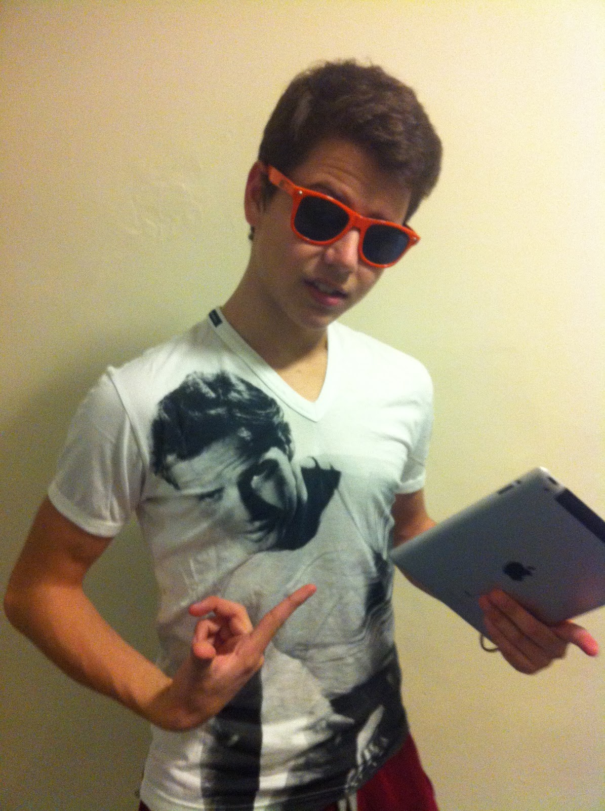
My young hip hop star is Josh Onjejocha which is known as “Jo z”. Jo z is an apprentice of world famous hip hop superstar Jay z. Jo z was born in Nigeria and in the age of 14 moved to the UK were I have met him and he kindly agreed on a photoshoot. I have picked Josh as my model as he looks like Jay z and he has charisma as well as he is looking good on pictures. I have taked around 120 pictures of Josh,however, I will post just some of them which in my opinion were the best .
Front Cover


Contents page
 Another superstar I've picked was Bosco Rosillo Del Rio, who is known for his sense of fashion and his good look. Most of the people who are interested in hip hop know him and would like to dress like him. Bosco is a perfect choice for my fashion section. As he is my friend he let me take some pictures of him and I have posted just some of them bellow.

Double Page Spread
As I said in on one of my previous posts I will be using the magazine with Jay z on double page spread as an example of my magazine.

Thursday, 5 January 2012

Planning Photoshoot

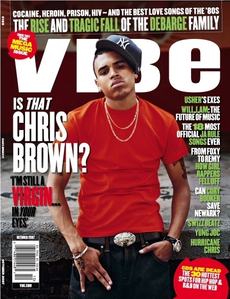
Today I have been working on my photoshoot and at first I started doing it by going through some of hip hop and rap famous magazines such as the source and vibe...:
As we can see from pictures provided above most of the magazines' front cover pictures are taken in a mid close up shot in order to make it clear who is the main star of the issue and it is a good idea which is going to be used in my magazine. Also, mostly, the background is something dark or something doesn't get a lot of readers' attention to concentrate them on the main star. Speaking about the way the "stars" present themself's all about how much money they have and to show their status and people love it. Their tatoos, watches, necklaces and sunglasses, clothes and hats, eveyrything must be matching and very fashionable and I have noted that.
Things I need to do for my photoshoot for the front cover:
-mid close up picture
-dark background or something doesn't get a lot of attention
-I need to be using a lot of flush stuff in my photoshoot such as watches,hats, necklaces and tatoos.

After having an idea of my front cover I started thinking of orginising my double page spread too and here are some examples I've looked at..:


As we can see from pictures provided above they are all different types of shots and they all look very interesting and attractive. Mostly pictures take up the most of the space on the left page and the text is put on the right page and it does look very good. Also the idea with whole page picture helps the photographer to show the model and help the reader to understand what and who he or she is reading about and as I mentioned before it helps the stars to flash their accessories and cloth. Speaking about background it is either a black or white wall and nothing else which helps the star to stand out. However, the white background attracts me more.
Thing I am going to do for the photoshoot of the double page spread :
-mid shot
-a big picture
-a lot of different accessories and outstanding clothes
-white background

Wednesday, 4 January 2012

Photography

Before starting planning my photoshoot I have decided to do some research on this subject in order to understand and know more. At first I was looking through some very popular blogs of extremely famous photographers and I really liked some of their photos such as.. :
Herb Ritts
Djimon with Octopus, Hollywood, 1989
Christy in Valentino, Miami, 1995
Julia Roberts, Malibu, 1990
Henri Cartier-Bresson
An example of street photography, which was the genre of choice for Cartier-Bresson

Annie Liebovitz
Annie always looked for some dramatic portraits

Ansel Adams

This is one of the most famous Ansel's photos taken in Yosemite
Also I really liked a tutorial video of how to take great portrait photos on youtube and this is the link to the video: http://www.youtube.com/watch?v=wyxQKNpk58U
This research will help me a lot to take some good pictures for my music magazine

Tuesday, 3 January 2012

Internet research

I have been researching for a couple of hours and found a lot of useful information about music magazines. Mostly I was searching for circualtion figures and I found some. They are listed below. This information was taken from http://www.wordpress.com/ , http://www.guardian.co.uk/

UK Music Magazine Circulation Figures

BBC Music 42,810 (45,144)*
Classic FM 32,534 (35,751)*
Classic Rock 71,242 (70,301 / 70,188)
Computer Music 17,427 (18,261)*
Future Music 10,862 (10,860)*
Gramophone 32,313 (34,628)*
Hot Press 18,394 (19,387)*
Kerrang! 41,125 (43,253 / 52,272)
Metal Hammer 41,777 (46,004 / 50,269)
Mixmag 26,116 (30,159)*
Mojo 98,484 (97,722 / 100,507)
NME 38,486 (40,948 / 48,459)
Q 94,811 (100,172 / 103,107)
Terrorizer 11,641 (13,786)*
Top of the Pops 107,576 (119,739)*
Uncut 75,518 (76,526 / 87,069)
Word 26,555 (34,280)*
Empire 194,236 (194,016)
Sight and Sound 19,842 (19,733)*
Total Film 81,029 (85,031)

NME's circulation slips 16.4%


NME was the biggest circulation faller among music and film magazines in the second half of 2010 with a 16.4% year-on-year decline.

Mojo was on the up compared with the first half of last year, retaining its status as the biggest paid-for music magazine, according to the latest Audit Bureau of Circulations figures out today.

IPC Media's NME, which was the only title in the sector to report a double-digit year-on-year fall, had a circulation of 32,166 in the second half of last year, a 5% fall on the previous six months.

Bauer Media's music title Mojo had an average monthly circulation of 98,484 and was the only title in the sector to show a period-on-period rise with circulation up 3.2% to 94,617. Mojo slipped 3.9% year on year.

Another Bauer music monthly, Q, held second spot with circulation of 88,240, down 6.9% year on year and 1.4% over the previous six months.

Bauer's movie magazine Empire recorded an 11.1% year-on-year drop to 172,639, but remains the biggest-circulation title in the film and music sector. This was a 3.6% fall over the previous period.

But Future Publishing's Total Film provided some cheer with a 3.4% rise in circulation compared with the first half of 2010 to 78,709. The magazine slipped back 2.9% year on year.

IPC Media's Uncut held on to third place among the paid-for rock music titles with sales down 2% period on period to 72,586, a 3.9% fall year on year.

Future Publishing's Classic Rock is within 5,000 copies of third place with 67,695, down 3.7% period on period and 5% year on year. Stablemate Metal Hammer had a small year-on-year circulation rise of 0.1% to 41,826, a 5% fall compared with the first six months of 2010.

Bauer's Kerrang! leapfrogged Metal Hammer to take fifth spot with a respectable 4.5% uplift in year-on-year circulation to 42,967. The title fell 2.4% period on period.

Channelfly Enterprises' free music monthly The Fly remained the music sector leader with an average distribution of 107,771, down 4% year on year and 3.4% period on period.

Future Plus's free film title, Odeon Magazine, was top of the film sector with an average distribution of 186,220, down 9.3% year on year and up 6.5% period on period.

Saturday, 17 December 2011

Audience Research Results

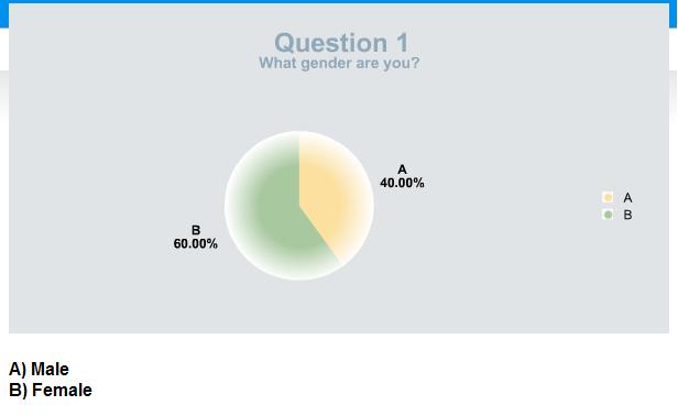
After uploading my survey on http://www.freeonlinesurvey.com/ I asked my classmates and my teacher to complete it.. I have made some graphs with results of the survey :


The "other" type of music included:
- House/ Electro
Question 8
What bands or artists would you want to see in a music magazine?
The answers were:

- Lil Wayne
Wiz Khalifa
- the most popular artists e.g rihanna, beyonce
- Latest and Popular bands. Bands that I that know and some new bands
- A band that I have not heard of.
- new teenage band which has g8 song like simple plan etc.
- Katy Perry
Snow Patrol
The Ting Tings
- Eminem
N-Dubz
50 Cent
- Kasabian, Placebo
- Skepta
- Swedish House Mafia
Eric Morillo
Avicii

etc.

Question 10
What appeals to you when buying a music magazine? (e.g. Front Cover, Masthead or Double Page Spread)

The answers for this question were:
- Front Cover
- front cover
- Front Cover
- What is said in the magazine; the doubla page spread.
- the image in the front cover and the cover lines
- Front cover - if the magazine features people I like, I'll buy it
- Front Cover
- Front cover
- Masthead
- The front cover- has to be colourful and eye-catching

After going through the survey's results I found out a lot about what people prefer and like in music. The results I have will help me to understand in which direction to create my magazine and what people would want to see in it. Mainly people who were asked to complete the survey were 15 - 19 years old. As far as I know teenagers prefer everything about superstars' lifes, their albums and interviews, how they dress (fashion) and what they do when they stuggle. However, I wanted to specify my magazine therefore I picked a genre for it by asking others. The genre I picked was hip hop & rap, which is mostly liked by all teenagers. As the purpose of the magazine is to gain some money I asked people how much would they be willing to spend and the price people picked the most was something between £3 - £4. Also by asking people to complete my servey I found out that everyone prefers to be getting some freebies and mostly it is free tickets, cd and posters. I had a think over that and decided that as people mostly buy music magazines every month or sometimes I will be putting some free tickets or cd's with posters every month into my magazine in order to attract people to buy it. However, I found out that people don't like participating in any kind of activities such as questionaires, so I am not going to add them or I will but very rarely. Also by going through the results I found out that people,mostly, get attracted by the fron cover and that's what leads them to buy a music magazine. Therefore, I will be working very hard on my front cover by adding a lot of colours to it with a very nice masthead.

Wednesday, 14 December 2011

Textual analysis of a music magazine

Front page analysis
"The New Musical Express (better known as the NME) is a popular music publication in the United Kingdom, published weekly since March 1952. It started as a music newspaper, and gradually moved toward a magazine format during the 1980s, changing from newsprint in 1998." - the information is taken from wikipedia.org
NME magazine is one of many music magazines, competing with other music magazines on sale, such as Kerrang and Q magazine.  ‘The XX’ are the cover stars of this issue; this is because they feature in an article in the magazine. The magazine stands out with its eye catching hot pink and white text against the darker areas of the front cover, in attempt to grab the audience’s attention along with the direct address of the band image. All members of the band are dressed in black, making it contrast against the lighter background colour; this may suit the genre of their music with their relaxed but serious facial expressions. Romy Croft is positioned between the other band members and is the centre focus point, showing she is the lead member of the group. Most of the image is covered by text “so what’s next for Britain’s new favourite band?” however the word ‘favourite’ is only an opinion but wants to reach out to the fans and to people who haven’t heard of them yet. There is also a quote from one of the band members “There’s no plan to do a second album...” this is to give people an insight into the article and to draw in the audience to discover more about the personal image of the band and to find out what they might have planned to do next.
The target audience is probably of the mid teens for both sexes, as the magazine is youthful with the types of genres they would be interested in and the wording is short and snappy. The masthead and the cover lines are presented in capitals and the text with ‘THE XX’ (centred) is the biggest typeface (besides from the masthead) is also in clashing pink and white, so the audience’s eyes are drawn to this.
‘Revealed: the best bands, the biggest let downs’, this makes the audience feel part of a secret, and there is something they can discover. The next subheading ‘New Manchester RIOT’ the word ‘riot’ is bigger than the rest, this grabs the audience’s attention and they will see this on the shelves when they buy it. Also on the bottom, left hand corner the text ‘+ more...’ attempts to hook the audience’s curiosity, its aim to get them to want to take a look inside at the rest of the contents of the magazine.  ‘Festival Poll 2010’ is something the audience can get involved in.
The cover doesn’t look crowded but the publisher has made good use of space and the text and layout is clearly presented. More bands such as Arctic Monkeys are listed down the right hand side, so the audience can see what else they will find inside the magazine, the ‘+’ as a symbol, not the word, plus. 

Content Page analysis


This contents page of NME magazine is clearly titled ‘INSIDE THIS WEEK’ in bold black serif font, in the top centre. The audience do not need to be told it is a contents page; they can easily tell by the page numbers and can see what they will find in the issue. The contents page is laid out in three columns; the reader can easily find what they are looking for quickly if they are looking for something in particular.  Some of the page numbers are presented larger than the rest along with a picture that is related, so the reader does not have to look through a list of pages numbers to find what they are searching for and gives the impression they are more important. There are also a few quotes and a description so the viewer can get an insight of what they will find on this page. There is plus columns, which has the rest of the page numbers, this is easy to spot and the page numbers are in bold.  In the right hand corner of the page there is a red box, the white text against the red looks eye catching, it is simple and does not over crowd the rest of the page.
Double Page Spread analysis

At the top of the double page spread, there is a quick description about the article to entice the reader, it is separated to act as a title but is only to give a glance for the audience.  There is also a subtitle underneath this which gains the reader’s interest before they read the whole interview. All text is in black some parts like quotes are in bold to highlight specific interests; the way the quotes cut into the article is effective as they are the most interesting quotes from the interview and they will want to read on. The use of the large ‘I’ and ‘F’ draws in the reader’s attention to the paragraphs. These paragraphs are organised into columns so, in my opinion, is easier to follow and looks neat. The first picture on the left page is related to the subtitle, the top picture on the right page gives the impression of the band more laid back and shows the bands normal behaviour, and what the band is like day-to-day. The quotes are close to the pictures which link them to the article and make them seem friendlier. The language used in the article is informal in order to find a better connection with the audience.

Tuesday, 13 December 2011

Textual analysis of a music magazine

Front Cover Analysis
The masthead is in lower case and capitals. It is also in sans serif which shows that it is current as well as the text colour. It is a light ‘young’ blue which makes it appealing to its audience. The masthead is fairly small in size compared to the other texts on the page and it attracts its target audience because it’s simple, yet cool and the way the text ‘presents’ is rotated at an angle gives it that edgy look. The main photograph is a medium close up of the artist Bow Wow in front of a grey backdrop which is lighted softly. The facial expression on the artists face is natural with a slight smirk on his face. Bow Wow’s photograph is positioned to the left of the page as opposed to the other images which are aligned to the right; this shows that there is a main story inside the magazine of the chosen artist (Bow Wow). Because the target audience of this magazine are black teenagers, readers can easily identify themselves with the photograph.
The texts on the front cover are in sans serif and predominantly in capitals. They are all of a medium weight and size. The colours that have been used are: black, blue, yellow, white and pink which represent energy and fun, this creates a youthful effect. Some of the texts are rotated at an angle which gives the front cover an edgy and cooler look and feel. There is a sketched image on the top right hand corner of the magazine. Another interesting element of the photographs is the way they are presented. Some photos have no background (e.g. Chris Brown & Rihanna), and the others that are used have a background (e.g. Jazmine Sullivan and Kelly Clarkson). The cover design establishes a house style with the word ‘black’ incorporated into the word ‘beat’. This is unique to the magazine company. This magazine cover will influence me in many ways, especially in the way the texts are positioned. I like the way this magazine has slightly rotated the texts.
Contents Page Analysis
The purpose of a contents page is to inform the reader of what is inside the magazine. The reader is able to navigate to the different sections of the magazine because the sections are in different colours for example, ‘Fashion and Beauty’ is in pink and ‘Music’ is in purple so it is easy for the reader to select specific parts of the magazine that they want to read. Also, the page numbers are very clear and the most important page number of each section is larger than the rest.
In the contents page, there are photographs of various images that relate to each category or the page. It also adheres to the overall house style of the music magazine with use of carefully selected images and audience friendly language. The page reveals that the reader is interested in fashion, music and celebrity entertainment.

 Double Page Spread Analysis
The main image is of the rapper Bow Wow. He is wearing casual clothing; this would be worn by the target audience. The interesting thing about the photograph is that it looks as if it has been torn. This is very smart as it reflects against the title BEWARE OF THE DOG’ seeming as if something dangerous has happened. The whole article is in sans serif font style, using a bright colour scheme (orange, green and blue). There are no columns in this feature page, neither is there an article, just two simple paragraphs.
Visit InfoServe for Blogger backgrounds.